
Visualization & reporting
Visualizing Global Obstacles to Student Data Services
A UCLA consultant cleaned and visualized DataSquad International's first cross-institution survey on what stops campuses from employing student data analysts.
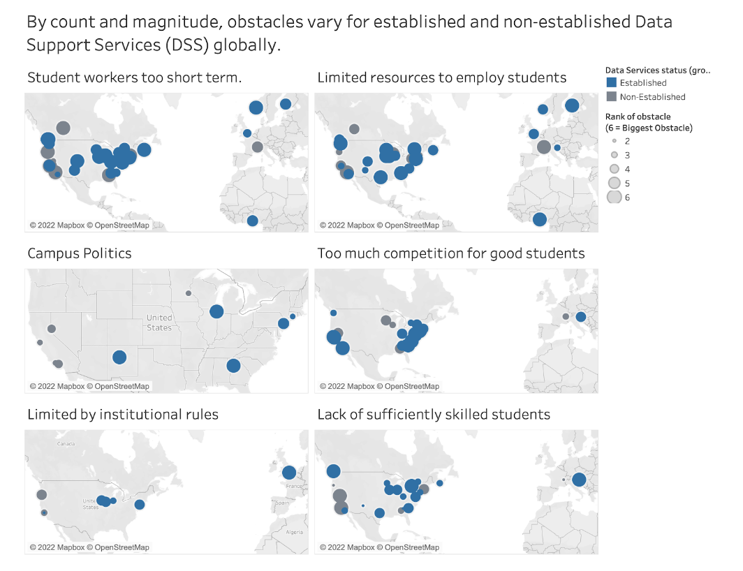
One of the most useful things a DataSquad member can bring to a project is being open to work outside their comfort zone. That was the case when Norman Powell Data Science Consultant Will Foote took on a Tableau project for DataSquad International, the nascent global organizing group for the network, despite not being the most experienced person on the team in Tableau.
Will worked with Tim Dennis (UCLA Library Data Science Center) and Paula Lackie (Carleton College DataSquad), the group’s co-leads, cleaning and visualizing survey data on the obstacles campuses face in employing students in Data Support Services (DSS) roles.
The analysis looked at how those obstacles related to location, whether a DSS team already employed students, and whether the team was established or still forming. Will used R to clean the data toward the vision Paula and Tim had for the project, then built the results out in Tableau to a publishable standard.
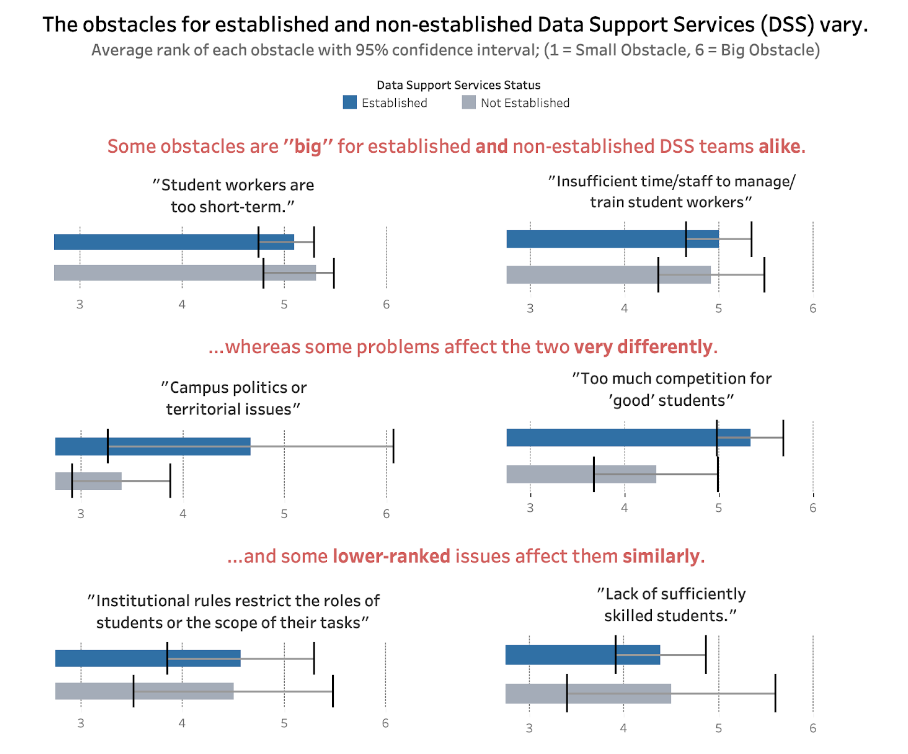
Frequent check-ins with Tim and Paula kept the analysis aligned with what the group needed, and Will picked up Tableau functionality he hadn’t used before along the way. The results fed into DataSquad International’s own recommendations on student employment obstacles, shared on the network’s website and at conferences in Europe and the US.
- Years
- 2022
- Partner
- DataSquad International
- Team
- Will Foote
- Tools
-
- Tableau
- R
- Source
- Originally published ↗